A better way to gauge and grow dance skill.
Prompt
Create an app that helps users learn a new skill.
The app was my capstone project for a UI/UX design Bootcamp I attended. We had a choice of prompts, one of the prompts was to create an app to help users learn a new skill. We decided on that prompt and chose dance as the skill.

My Role
UI/UX Designer
I was a part of a team with two other designers, hailing from Norway, Florida, and California. Time zones were a fun challenge to overcome!
Table of Contents
- The Journey begins
- Curiosity
- SWOT analysis
- User Research
- Personas
- Problem Statement
- Synthesize
- MVP
- Structure
- Usability Insights
- Visual Design
- Final Frames
1. The Journey Begins
Our journey began with two perspectives we were curious to explore!

We wanted a clue as to the viability of a digital product for dance.

We realized dance carried cultural nuances and wanted to know how they may affect our solution.

Viability
It was interesting to find that as of 2021, dance studios are a 3.7 billion dollar industry in America alone. Our solution would now not only be geared towards dancers but specifically dance studios.
Cultural nuances
Community respect
Dance culture is both adversarial and communal. While dance studios are highly competitive, they will typically rely on each other for solutions, and stick together when the odds are against them. A solution must carry and communicate respect for the dance studio culture in order to be widely accepted.
What is a good dancer?
If you want to start an internet war, post this question in any dance forum! We did just that and found a myriad of answers. The conclusion we came to was that dance is both an art and a craft. How much of one or the other dance is can never be fully distinguished. The dance culture recognizes that while tangible skills play a significant role, there needs to be plenty of room for interpretation.
2. Curiosity
These initial discoveries lead us to ask what proved to be a very revealing and powerful question.

How are you gauging student skill level and tracking progress?
We asked that question to a dance forum of over 15k people, and the response was astounding.
The vast majority did not have a system, or at best used a star chart. We realized while a teacher's assessment may be accurate, studios lacked an effective way to communicate specifically where a student was on their journey from one level to the next.
We then decided that our solution should carry the following attributes
- It should fit the needs of a studio as well as a dancer.
- It should have a way to accurately and visually show skill level and progress.
- The solution needs room for interpretation in its application.
We weren’t sure if anything like this existed, so we performed a SWOT analysis to find out what our competition might be.
3. Competition
Our SWOT analysis began to inform the solutions we may be able to design.
Strength
- Availability to anyone worldwide.
- Learn at your own pace, on your own schedule
- Wide range of styles and teachers offers a more robust learning experience
Weakness
- No detailed approach to the journey of the dancer
- Lacking organized growth trackers that show the necessary steps to move forward
- Doesn’t offer quality feedback from teachers
Opportunity
- Creating a system that outlines the necessary steps to journey from one level to the next
- A learning experience that focuses on different dance purposes
- Integrated tracking that shows time spent, proximity to next level, and skills needed to move forward
Threat
- A company with a well-established dance community influence
- A higher level of technology integration
- Online learning burnout due to lack of in-person connection
The solutions we began to ideate needed refinement, and we wanted to ensure they met the current needs of dance students. We then turned to the fun work of user research!
Prompt
Create an app that helps users learn a new skill.

The app was my capstone project for a UI/UX design Bootcamp I
attended. We had a choice of prompts, one of the prompts was to
create an app to help users learn a new skill. We decided on that
prompt and chose dance as the skill.


I was a part of a team with two other designers, hailing
from Norway, Florida, and California. Time zones were a
fun challenge to overcome!
Table of Contents

- The Journey begins
- Curiosity
- SWOT analysis
- User Research
- Personas
- Problem Statement
- Synthesize
- MVP
- Structure
- Usability Insights
- Visual Design
- Final Frames

1. The Journey Begins
Our journey began with two perspectives we were curious
to explore!

We wanted a clue as to the viability of a digital
product for dance.

We realized dance carried cultural nuances and
wanted to know how they may affect
our solution.

Viability
It was interesting to find that as of 2021, dance studios are a 3.7
billion dollar industry in America alone. Our solution would now
not only be geared towards dancers but specifically dance studios.
Cultural nuances
Community respect
Dance culture is both adversarial and communal. While dance studios are
highly competitive, they will typically rely on each other for solutions, and
stick together when the odds are against them. A solution must carry and
communicate respect for the dance studio culture in order to be
widely accepted.
What is a good dancer?
If you want to start an internet war, post this question in any dance forum!
We did just that and found a myriad of answers. We came to the conclusion
that dance is both an art and a craft. How much of one or the other
dance is can never be fully distinguished. The dance culture recognizes
that while tangible skills play a significant role, there needs to be plenty of
room for interpretation.
2. Curiosity
These initial discoveries lead us to ask what proved to be a very
revealing and powerful question.
How are you gauging student skill level and
tracking progress?
We asked that question to a dance forum of over 15k people,
and the response was astounding.
The vast majority did not have a system, or at best used a star chart. We
realized while a teacher's assessment may be accurate, studios lacked an
effective way to communicate specifically where a student was on their
journey from one level to the next.
We then decided that our solution should carry the following attributes.
- It should fit the needs of a studio as well as
a dancer. - It should have a way to accurately and visually show skill level and progress.
- The solution needs room for interpretation in its application.


We weren’t sure if anything like this existed,
so we performed a SWOT analysis to find
out what our competition might be.
3. Competition
Our SWOT analysis began to inform the solutions we
may be able to design.

The solutions we began to ideate needed refinement, and we wanted to
make sure they met the current needs of dance students. We then turned
to the fun work of user research!
4. User Research
After receiving 84 survey responses and performing 6 one-on-one
interviews, we had a much deeper understanding of what dancers
need that studios are not currently providing.
Survey:

Teacher Feedback
Dancer Level Clarity
Individual Skills Focus
When asked about the challenges of learning dance online, the overwhelming majority mentioned teacher feedback as the biggest drawback.
As we further discussed with our interviewees, we realized that much of what they needed, from motivation to clarity in skill level, pointed back to a way to communicate what skill level a dancer was and how close they were to reaching their next goal.
Individualized critiques were a topic that commonly came up during the interviews we performed. One dance student even remarked that "class should not be taught as one size fits all". Identifying and communicating what a particular student needed in-between class times seemed to be a challenge, but we were confident we would find a solution!

After drawing from our qualitative and quantitative findings, we had a
good understanding of who our users might be. This informed the
personas we were able to create.
5. Personas
Our research led us to create two personas that provided a stronger
connection and empathy with dancers who may use our app.
6. Problem Statement
Assimilating our findings with the power of empathy, and eureka! We discovered the problem to be solved.

A dancer’s ability to recognize their skill level is challenging and increasingly more difficult as they progress.
Although studios have great programs, there is a need for a tailored approach that clearly identifies skill level and the progress necessary, both in studios and online.
7. Synthesize
We utilized affinity mapping to synthesize our findings.
Lack dancers felt
Skill Development
Structure
Motivation
Personal Feedback
Guided Experience
Progress Tracking

How we might solve


Our affinity map helped us discover what the dancers felt they
were lacking. It also gave insights into possible solutions. This
information, along with input from the dancers, developed the
MVP for our product.

8. MVP
The MVP and key features utilize concepts that studios are already familiar with but have not been able to leverage in their studios until now!
MVP
Key Features
The MVP and key features began to drive our design concepts, and a structure was born!
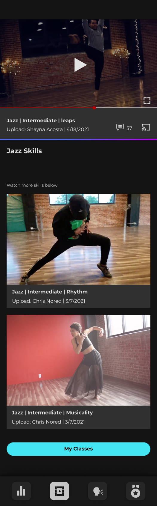
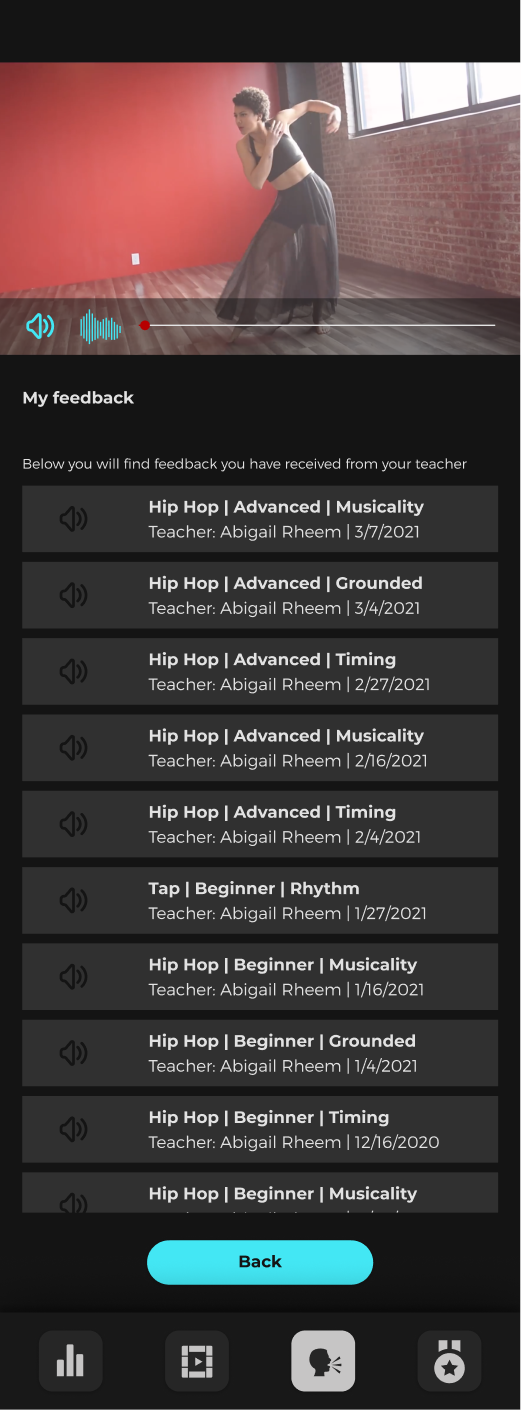
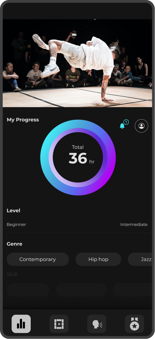
- Video submission and recorded reply for personalized teacher feedback.
- Visual markers to communicate precise skill level
and progression. - Suggested skills with corresponding classes for a guided experience.
An app that clearly distinguishes growth and gives teacher
feedback on dance skills necessary to move to the next level.
9. Structure
Once our MVP and key features were set, our
site map and user flow began to form!

We were aware that our solutions had to make sense
for dancers as well as dance educators. Since the dance
educators needed to play a role engaging with the app,
we strived to make the flow as simple and seamless
as possible.
As we continued to develop our wireframes, we
realized an experience for dance educators was
necessary as well. These are the beginning of our
wireframes for the dance educator experience!
Teacher Experience Wireframes
10. Usability Insights
After our initial wireframes, we created a simple
prototype for testing. Our responses gave incredible
insight into how we should iterate and proceed!
Student
After using the product, many of our student users communicated
a strong desire for the app to be in a current working phase.
Students found most valuable the visualization of their current
level and the ability to receive detailed video feedback.
Our students felt the information could be consolidated to create
fewer clicks. This would give them quicker access to the info they
needed most.
Teacher
Overall, teachers found high value in the app and agreed with its
usefulness in giving feedback as well as distinguishing
student growth.
They felt the dashboard could be more simplified and pointed
towards either a student list or information at a glance, but
carrying both felt somewhat cluttered.

11. Visual Design
Color and aesthetics are added to emphasize the
experience for the dancers. It’s alive!
The primary turquoise color gives a bright
contrast to the black background without
loosing its friendly feel. Its goes well with the
light grey that is used for typography.
The primary black is a softer black that is easy on
the eyes.
Secondary
The secondary colors are there to create slight
variations in the tones of grey and black, making
the overall product more alive and balanced.
The blue will be used in combination with the
light purple as a gradient on lines.
Primary

Secondary

Montserrat is a typeface that feels exclusive yet
diverse in its use. It allows for variation, and its
readability is good even with a small type scale.
Aa
Montserrat Bold
ABCDEFGHIJKLMNOPQRSTUVWXYZ
abcdefghijklmnopqrstuvwxyz!?;,.
Aa
Montserrat Medium
ABCDEFGHIJKLMNOPQRSTUVWXYZ
abcdefghijklmnopqrstuvwxyz!?;,.
Aa
Montserrat Light
ABCDEFGHIJKLMNOPQRSTUVWXYZ
abcdefghijklmnopqrstuvwxyz!?;,.

Headline 1
Bold 16px
Color #E2E2E2
Headline 2
Bold 12px
Color #E2E2E2
Headline 3
Medium 12px
Color #E2E2E2
Paragraph
Light 12px
Color #E2E2E2
Paragraph
Light 10px
Color #E2E2E2
Navigation Bar
The navigation bar houses the buttons progress,
archive, feedback, and goals. The bar uses a
shadow to better distinguish itself from the
frame it overlays.
The background bar is slightly darker
in color then the buttons it houses. The darker
background brings attention to the buttons
while maintaining visual comfort.

Navigation Buttons
Each button contains an icon that
communicates its respective functionality. The
buttons are slightly lighter than the bar behind
them, while the icons are a much lighter grey to
provide appropriate contrast.
While a particular button is selected, it will
inverse in its visual presentation. The button will
take a lighter grey, while the icon inside
becomes almost absolute black.

UI Elements
The elements brings variation in color and shape
marking different usage and where they belong
Icons, Lines, and Keyboard
The icons chosen are a non-verbal way to
communicate actions to take. They are smaller
and simple to allow for small-scale readability.
The lines help to guide the reader and
distinguish between sections.
12. Final Frames
After extensive iteration and testing, we finally came to a
design that we believed would provide a better solution
and aide to gauge and grow dance skills.
Teacher View Student Goals
Conclusion
This project revealed real challenges that a dancer may be facing in their learning journey and the respective solutions that a digital product can bring. We discovered the need for a better system to show dancers precisely at what level they are performing, then created the necessary visual and audible tools to communicate their areas of improvement and skills needed to move forward.
As this project grew, we did begin to ideate a "phase 2", which would include more of an open-source feel. Who knows, that may be a venture we pursue in the future!
4. User Research
Our research led us to create two personas that provided a stronger connection and empathy with dancers who may use our app.
Survey:
Would like a guided experience.
Would like personalized feedback from instructors.
Would like to track their progress
Felt that having no teacher interaction was biggest challenge learning dance online.
Felt the biggest challenge in growing as a dancer was learning dance steps/foundation.
Interviews:
Teacher Feedback
When asked about the challenges of learning dance online, the overwhelming majority mentioned teacher feedback as the biggest drawback.
Dancer Level Clarity
As we further discussed with our interviewees, we realized that much of what they needed, from motivation to clarity in skill level, pointed back to a way to communicate what skill level a dancer was and how close they were to reaching their next goal.
Individual Skills Focus
Individualized critiques are a topic that commonly came up during the interviews we performed. One dance student even remarked that "class should not be taught as one size fits all". Identifying and communicating what a particular student needed in-between class times seemed to be a challenge, but we were confident we would find a solution!
After drawing from our qualitative and quantitative findings, we had a good understanding of who our users might be. This informed the personas we were able to create.
5. Personas
Our research led us to create two personas that provided a stronger connection and empathy with dancers who may use our app.
6 Problem Statement
Assimilating our findings with the power of empathy, and eureka! We discovered the problem to be solved.
A dancer’s ability to recognize their skill level is challenging and increasingly more difficult as they progress.
Although studios have great programs, there is a need for a tailored approach that clearly identifies skill level and the progress necessary, both in studios and online.
7. Synthesize
We utilized affinity mapping to synthesize our findings.
Affinity Mapping
Lack dancers felt
Skill Development
How we might solve
Personalized Feedback

Lack dancers felt
Structure
How we might solve
Guided Experience

Lack dancers felt
Motivation
How we might solve
Progress Tracking

Our affinity map helped us discover what the dancers felt they were lacking. It also gave insights into possible solutions. This information, along with input from the dancers, developed the MVP for our product.
8. MVP
The MVP and key features utilize concepts that studios are already familiar with but were unable to leverage in their studios until now!
MVP
An app that clearly distinguishes growth and gives teacher feedback on dance skills necessary to move to the next level.
Key Features
- Video submission and recorded reply for personalized teacher feedback.
- Visual markers to communicate precise skill level and progression.
- Suggested skills with corresponding classes for a guided experience.
9. Structure
Once our MVP and key features were set, our site map and user flow began to form!
We were aware that our solutions had to make sense for dancers as well as dance educators. Since the dance educators needed to play a role engaging with the app, we strived to make the flow as simple and seamless as possible.
User Flow

Sitemap

Wireframes

As we continued to develop our wireframes, we realized an experience for dance educators was necessary as well. These are the beginning of our wireframes for the dance educator exprience!
Teacher Wireframes

After our initial wireframes, we created a simple prototype for testing. Our responses gave incredible insight into how we should iterate and proceed!
11. Visual Design
Color and aesthetics are added to emphasize the experience for the dancers. It’s alive!
Colors
Primary
The primary turquoise color gives a bright contrast to the black background without loosing its friendly feel. Its goes well with the light grey that is used for typography.
The primary black is a softer black that is easy on the eyes.
Secondary
The secondary colors are there to create slight variations in the tones of grey and black, making the overall product more alive and balanced.
The blue will be used in combination with the light purple as a gradient on lines.
Primary

Secondary

Typography
Montserrat
Montserrat is a typeface that feels exclusive yet diverse in its use. It allows for variation, and its readability is good even with a small type scale.
Aa
Montserrat Bold
ABCDEFGHIJKLMNOPQRSTUVWXYZ
abcdefghijklmnopqrstuvwxyz!?;,.
Aa
Montserrat Medium
ABCDEFGHIJKLMNOPQRSTUVWXYZ
abcdefghijklmnopqrstuvwxyz!?;,.
Aa
Montserrat Light
ABCDEFGHIJKLMNOPQRSTUVWXYZ
abcdefghijklmnopqrstuvwxyz!?;,.
Headline 1
Bold 16px
Headline 2
Bold 12px
Headline 3
Regular 12px
Paragraph
Light 12px
Paragraph
Light 10px
12. Final Frames
After extensive iteration and testing, we finally came to a design that we believed would provide a better solution and aide to gauge and grow dance skills.
Login Screens
Landing Screens
Video Archives
Goals Screens
Feedback Request
Feedback Given
Conclusion
This project revealed real challenges that a dancer may be facing in their learning journey and the respective solutions that a digital product can bring. We discovered the need for a better system to show dancers precisely at what level they are performing, then created the necessary visual and audible tools to communicate their areas of improvement and skills needed to move forward.As this project grew, we did begin to ideate a "phase 2", which would include more of an open-source feel. Who knows, that may be a venture we pursue in the future!